

The Importance of Mobile-Friendly Websites in 2019
 by Erica Lovestrand
Chances are, you've already heard that your website needs to be mobile-friendly if you want to be competitive in today's online market. When Mobilegeddon occurred, tons of companies raced to make their sites mobile-friendly, but for those of you who haven't made the switch yet, you might be wondering if having a mobile-friendly site is really important for your business.
How Important is Mobile Really?
Mobile Internet Use - In October 2016, mobile traffic officially surpassed desktop traffic on the internet.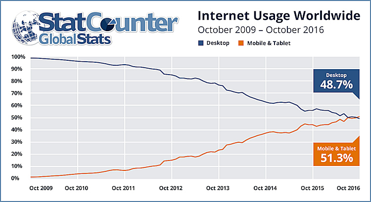
For the past 3 years, people have consistently accessed the internet from their mobile phone or tablet more than from a desktop or laptop computer. Desktop traffic has actually been decreasing for more than a decade and mobile internet use continues to grow.
Back in 2017, it was predicted that by the end of 2019, mobile would account for 79% of all web traffic. This could mean that people are looking at the desktop version of your website only 20% of the time. And if your site doesn't work well or look right on a mobile device? Studies show people will simply stop visiting it in favor of a site that provides a better mobile experience.
How Does Your Audience Browse?
Despite the overall trend towards mobile, there are still some industries where most website traffic still comes from desktop computers. Analyze your buyer personas to get a better idea of how your audience browses the web. Mobile is especially crucial to local service-based industries, like locksmith services, for example. Someone in need of emergency roadside service is almost certainly going to search for a local business using their mobile device.
But while mobile may be more important for some industries than others, user preference and browsing habits aren't the only things to consider regarding having a mobile-friendly website.
Mobile-Friendliness and SEO
Of all the factors looked at by Google when deciding how to rank your website on search engines, mobile usability is ranked as the third most important of all the factors. Google made an even bigger shift to mobile in November 2016 when it declared that it would crawl the mobile version of websites before the desktop version. Furthermore, Google is going to take its ranking signals from the mobile version of your website, not the desktop version. This could affect your rankings in Google.
Mobile-Friendly Responsive Design
If you've created or redesigned your website in the past couple of years, chances are your developer used responsive design. Responsive design adapts the display of your website to the size of the device screen being used. In some cases, this means an auto-resizing of the content. In other cases, it can mean a drastically different appearance with simplified content or different, mobile-friendly navigation, for instance.
Some businesses realize that the majority of their traffic comes from mobile and that they can't possibly convey an optimal user experience simply using a responsive version of their website, so they develop a mobile app. Amazon is one example of a company that realized its huge website would be really difficult to use on a mobile device, hence the popularity of their app.
Maintaining an optimized version of both your desktop and your mobile websites may not be the best use of your resources, either. Again, review your web analytics to see how most people use your site when deciding how to allocate mobile development and optimization resources.
Mobile-Friendly Content
A well-executed responsive website design will ensure that navigation and images adapt attractively to the mobile experience. On mobile, the text becomes even more important, due to the limited space available. When writing content for your mobile site, strive to be concise, purposeful, and readable with headers and callouts to help your reader quickly navigate your site's information. Remember to keep your calls to action especially prominent on mobile with easy-to-read buttons or call outs.
Mobile-Friendly Websites Improve Your Bottom Line
Mobile-friendliness is good for business. A recent case study for shoe company "Offspring" showed that using responsive web design increased their search engine rankings by 77.59% and their mobile conversion rate by 15.19%. By using mobile-friendly elements like a large site search bar and a "sticky" header (one that stays in place throughout scrolling), they made their site easier to use on mobile and tablet, thus keeping more visitors on their site longer, and ultimately generating more sales.
Make Your Website Mobile-Friendly TODAY...
Why a Digital First Approach Is Essential

If your audience spends time in any of these digital spaces, then it’s crucial to have a presence there. Otherwise, your just making way for the competition. One of the most crucial tools for building a digital brand is content, which includes things like webpages, blogs, emails, social posts, videos, and more. [Read]